CGI
art direction
packaging design
branding
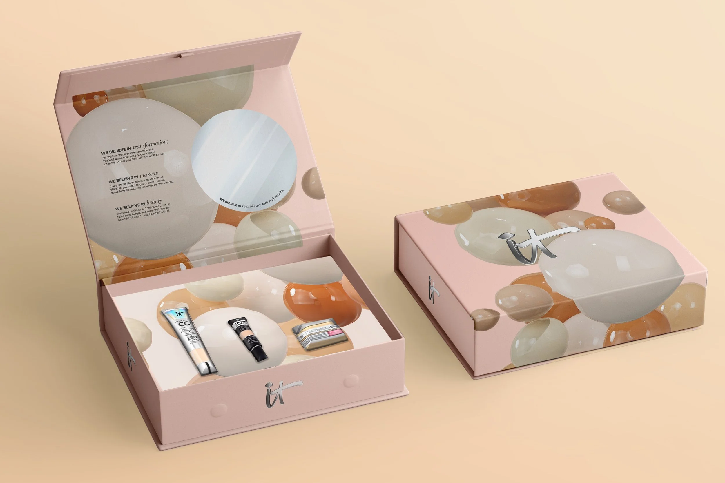
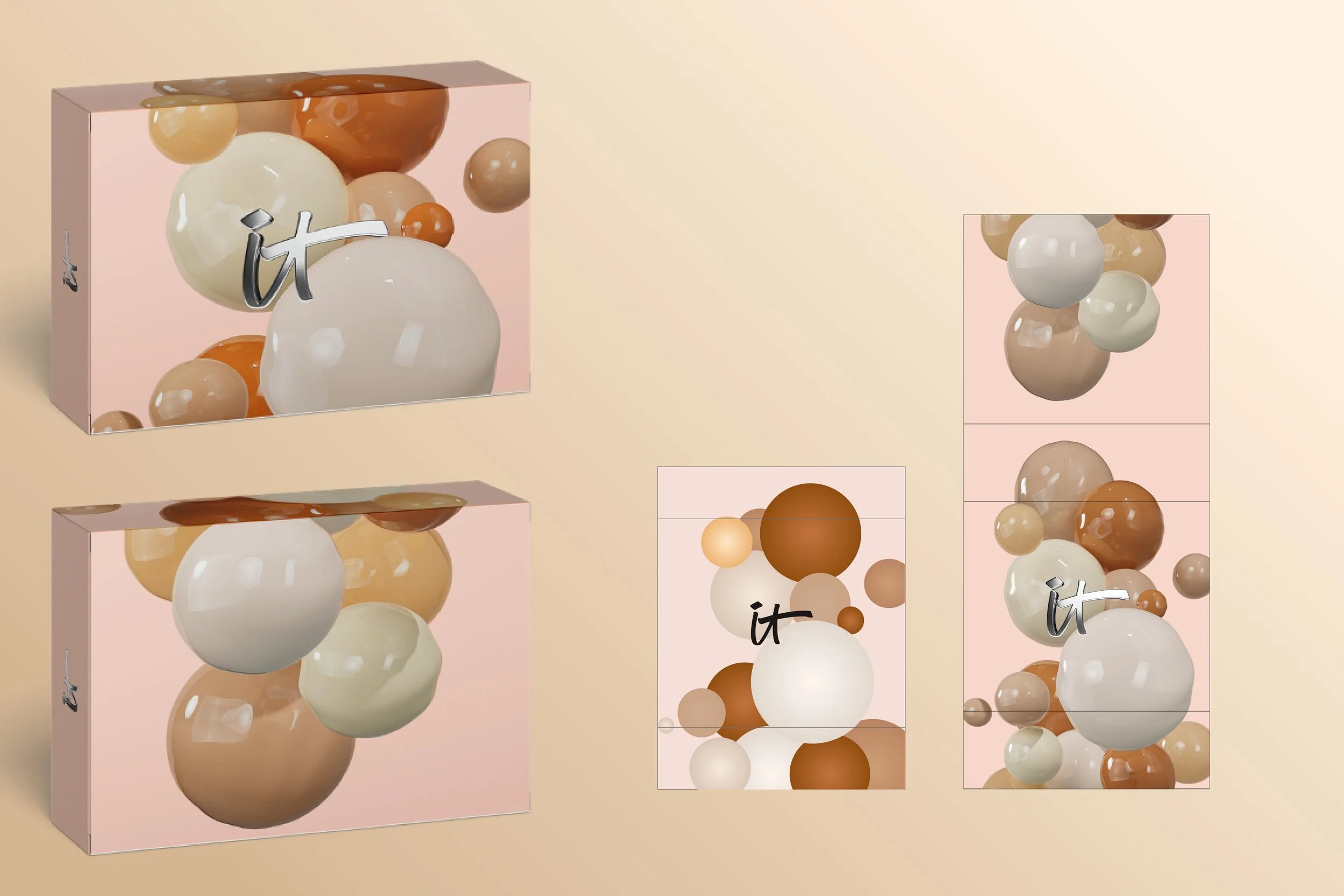
It Cosmetics has recently launched several products in Asia, and I helped develop their first CGI campaign. I created several assets featuring their best selling products. I was responsible for research and development, layout, and look development. I created their box packaging for this campaign as well.
I personally think there was a lot of creative freedom given to me for this project and I enjoyed testing out different compositions.
Packaging design:
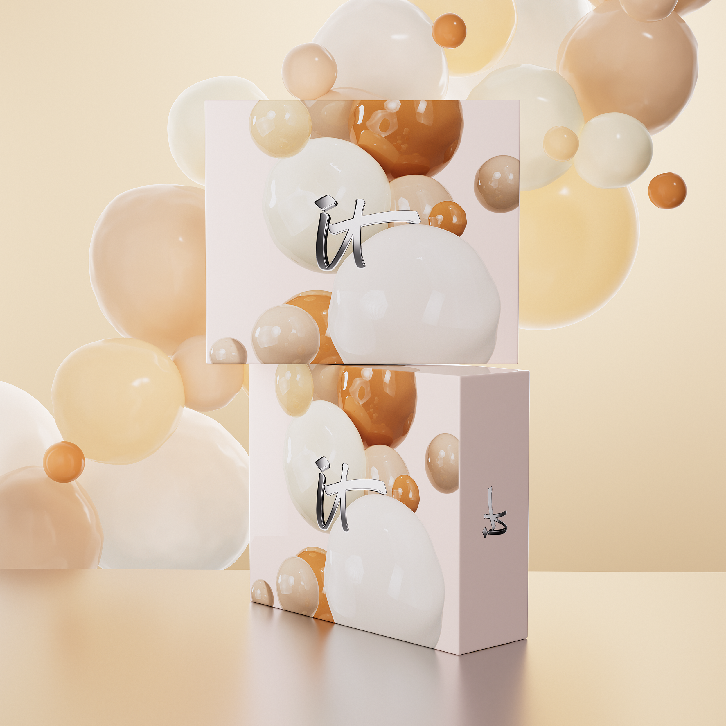
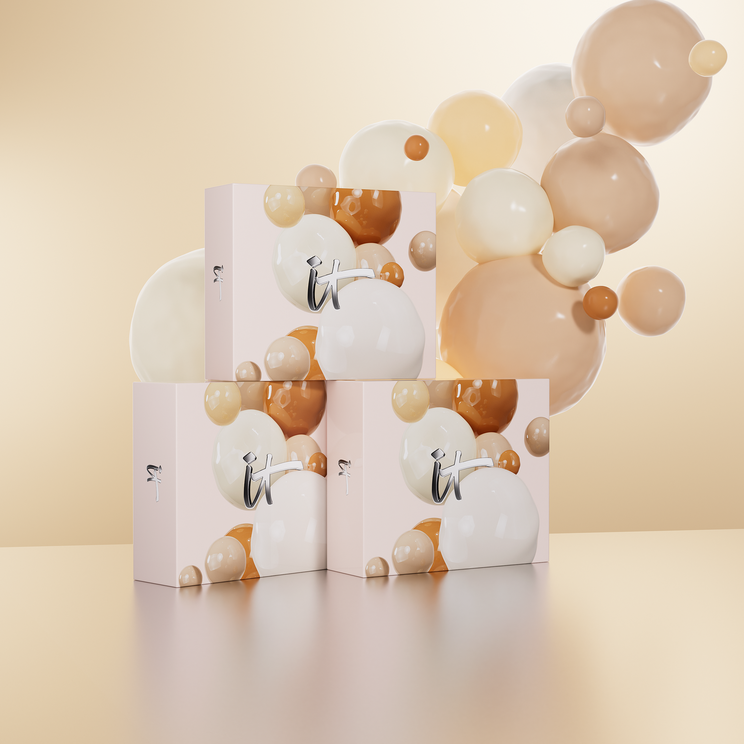
It Cosmetics came to us wanting their new box gift sets to feature a 3D-rendered image of organic “blobs” with different skin colors. Since the campaign’s target audience is mainly Asian women, we knew we needed to keep lighter skin tones more prominent in the artwork overall.
Using Cinema 4D and Octane, I created different iterations of these “blobs”, testing out different lighting setups, as well as finding a happy medium between shiny and matte textures.
As for the overall scene in this render, It Cosmetics asked that we feature more blobs in the background with more prominent backlighting to represent that iconic glow their products give your skin.
Hero images:
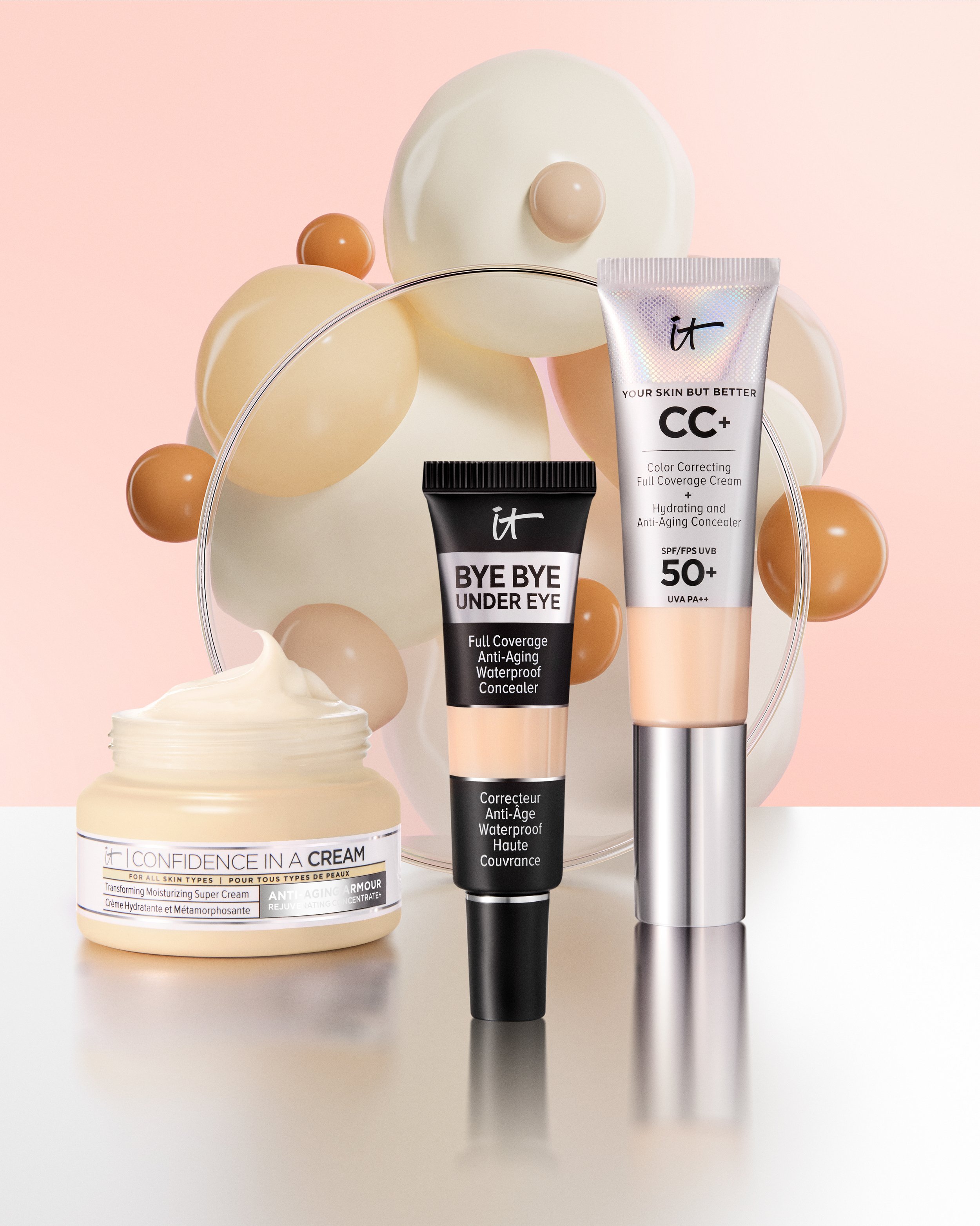
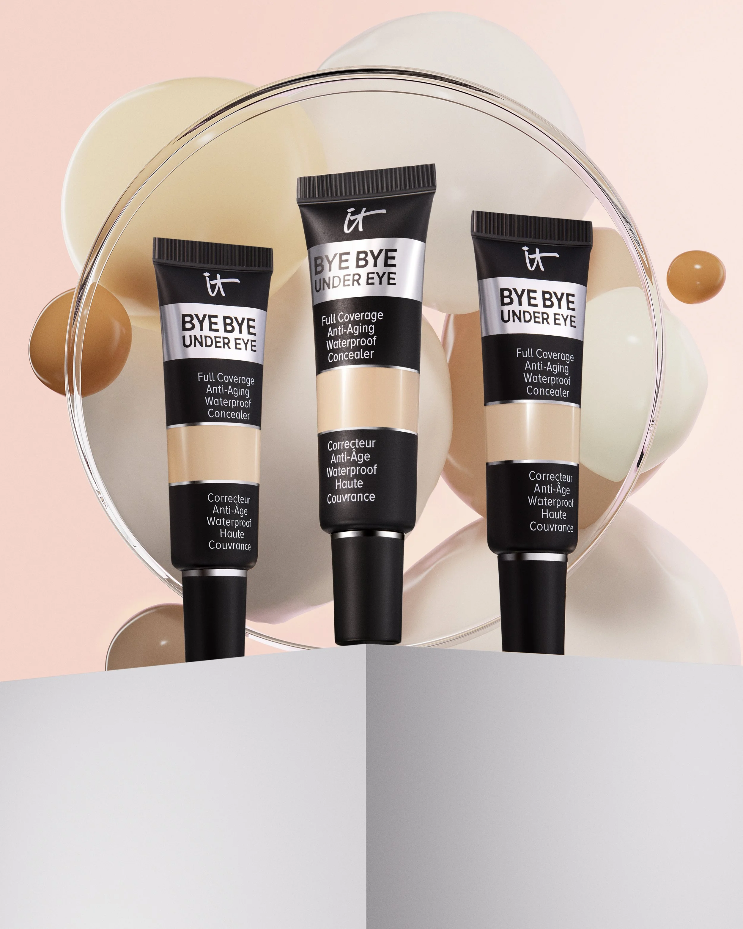
It Cosmetics wanted us to create a series of hero images with a silver floor and different colored backgrounds, namely light pink, beige, and silver.
Again using the organic “blob” shapes, we opted to use a bunch of different sizes. I used a deformer for each shape with a different seed value to offset the creases and make sure each one was unique.
The remaining hero shots (see below) follow a very similar visual hierarchy.

